Charts
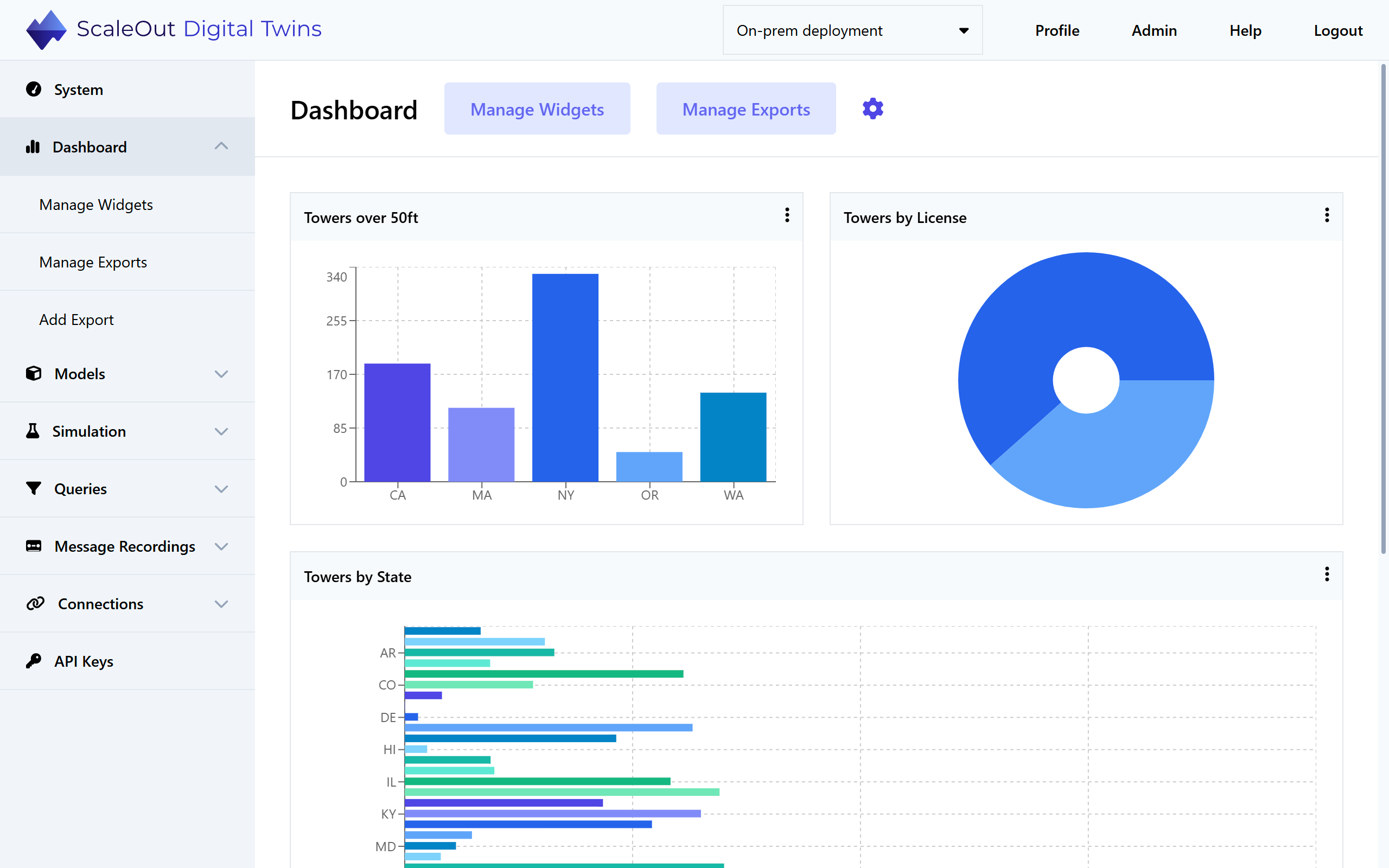
The ScaleOut Digital Twins UI enables you to design and manage a dashboard of real-time charts. Charts aggregate information stored in digital twin instances, combining real-time data from thousands of digital twins to help you identify emerging trends. Charts display aggregated results on the UI’s dashboard and update them continuously (approximately every 5-10 seconds).
The following sections explain how to create and manage charts.
Creating Dashboard Charts
To create a new chart, navigate to the Dashboard page in the left-side navigation bar.
Note
You will need to deploy at least one digital twin model before creating any charts. See the Creating a Digital Twin Model section for more information.
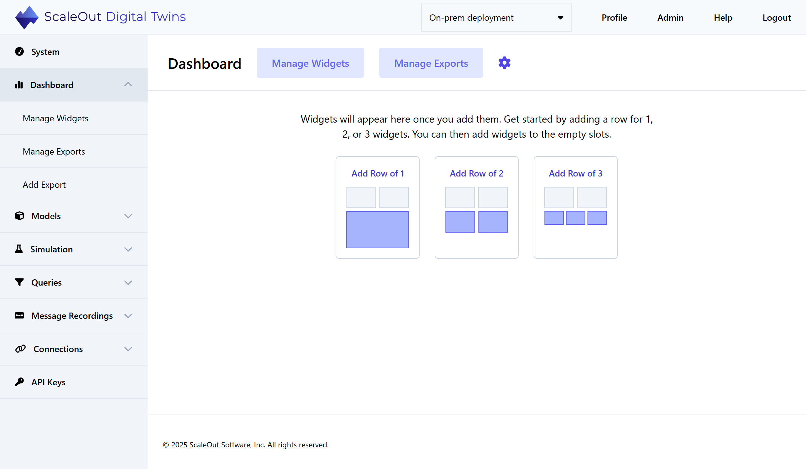
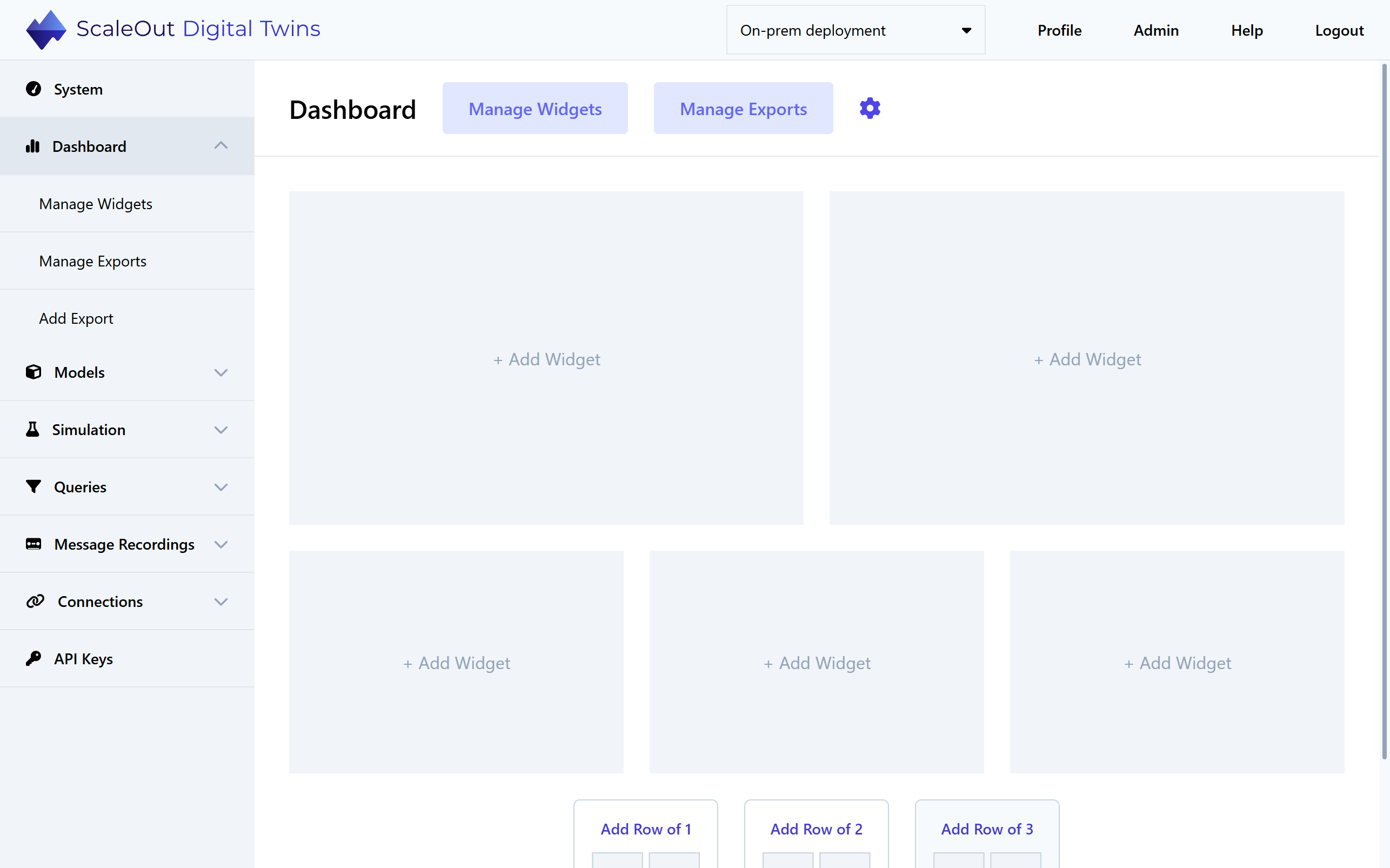
Start designing your dashboard by adding placeholder slots for charts. You can create rows for one large chart, two medium-sized charts, or three small charts. Click on any empty slot to add a chart to it.
Note
At small screen resolutions, the charts will display as a single column.
Clicking on an empty slot will bring you to the Add Chart page.
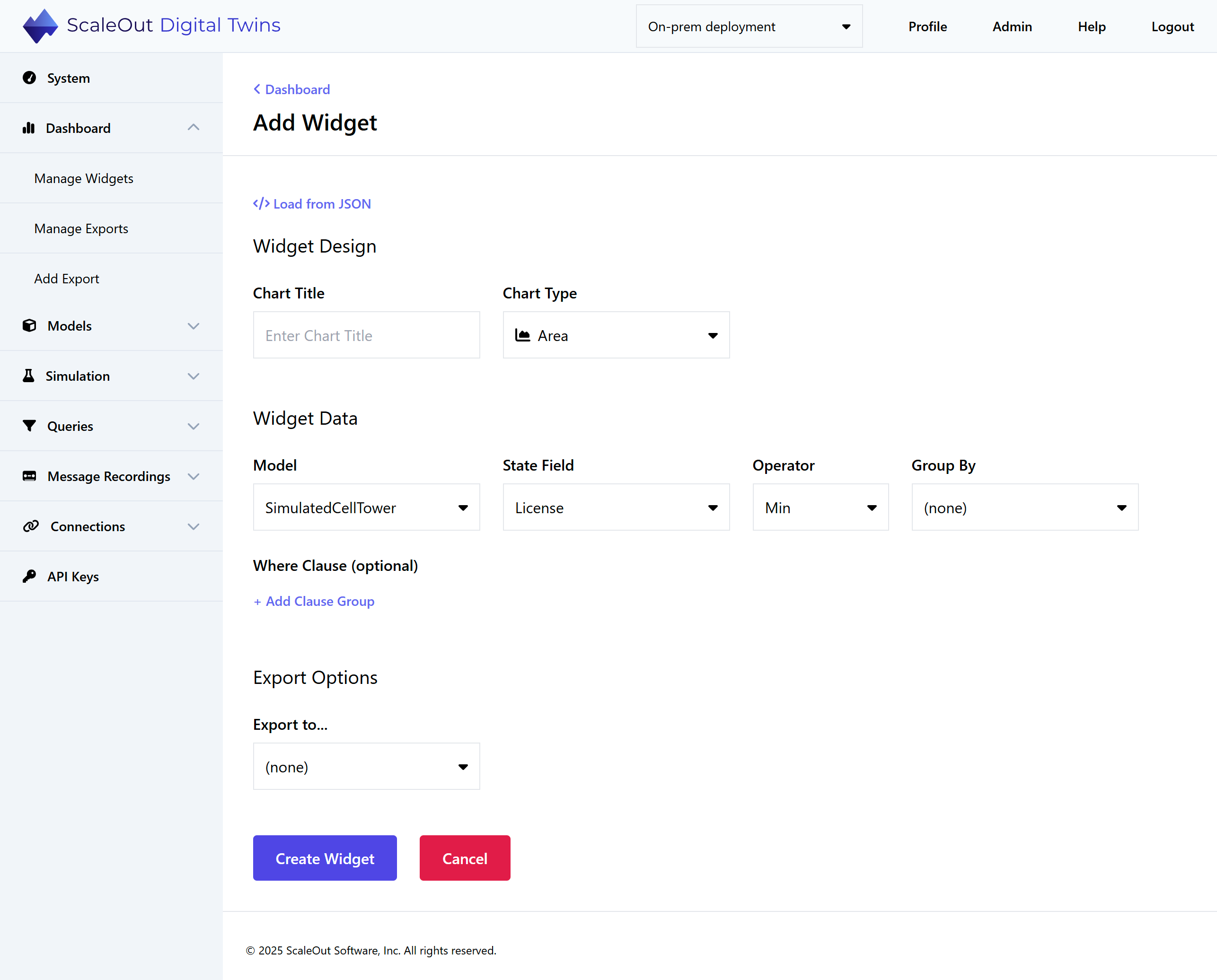
Under Chart Design, give the chart a title and select a layout. Supported layouts are Area, Bar, Column, Line, or Pie.
Under Chart Data, select the data for your chart:
Model: The digital twin model to be queried
State Field: Property of the digital twin to be aggregated
Operator: Aggregation operator that will calculate the values displayed in the chart
Group By: Group the results based on unique values of the selected digital twin property
Where Clause (optional): Filter the digital twin instances to be included in the aggregation
Under Export Options, select an exporter (such as a Power BI connection) if desired. To use this feature, you’ll need to add an exporter first.
The Load from JSON button gives you the option to load a chart specification from a JSON file. For how to obtain this file, see Managing Charts.
Finally, click the Create Chart button at the bottom of the page to create the chart. Within a few seconds, the new chart will populate with real-time data and automatically refresh every few seconds as new data becomes available. You can create multiple charts by following the same steps.
Building Where Clauses
The where clause builder enables you to create clause groups, each of which has one or more where clauses. Each where clause operates on a single numeric or string property. Click on Add Where to add another where clause to a clause group, or add a clause group by clicking on Add Clause Group. Both where clauses and clause groups are joined together with either the logical AND or OR operator.
Hint
You can think of clause groups as adding parentheses around a set of where clauses. First, the where clauses within each group are evaluated, and next the results of the groups are combined. For example, you can express ((A and B and C) or (D and E and F)) using two clause groups, each with three where clauses.
Where Clause Examples
The following examples illustrate some of the things you can do with SQL-like where clauses.
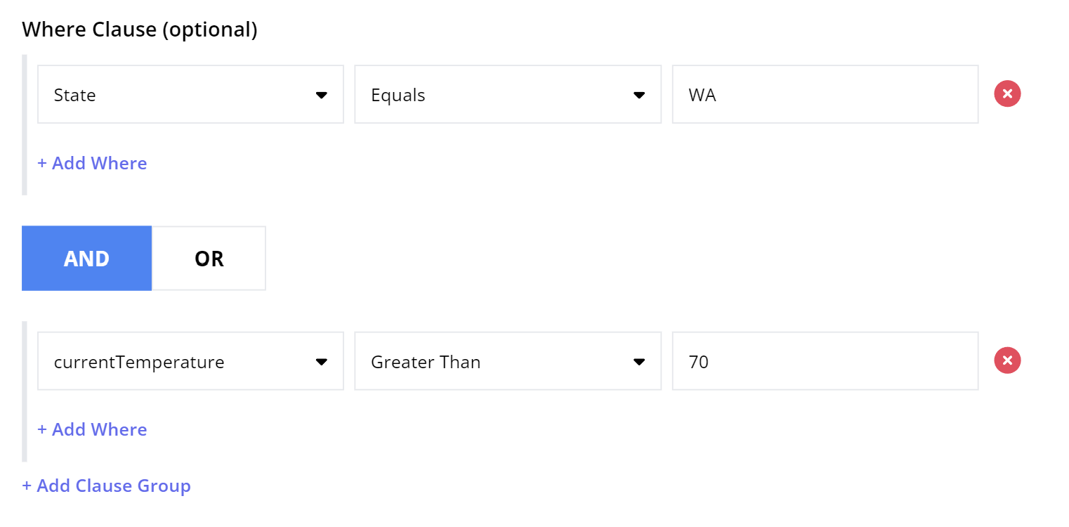
Example 1: Select all cell towers in Washington State with a current temperature greater than 70 degrees F:
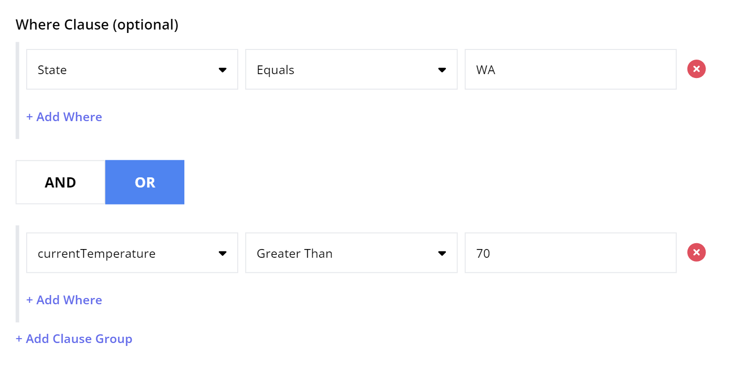
Example 2: Select all cell towers that are either in Washington State OR have current temperature greater than 70 degrees F:
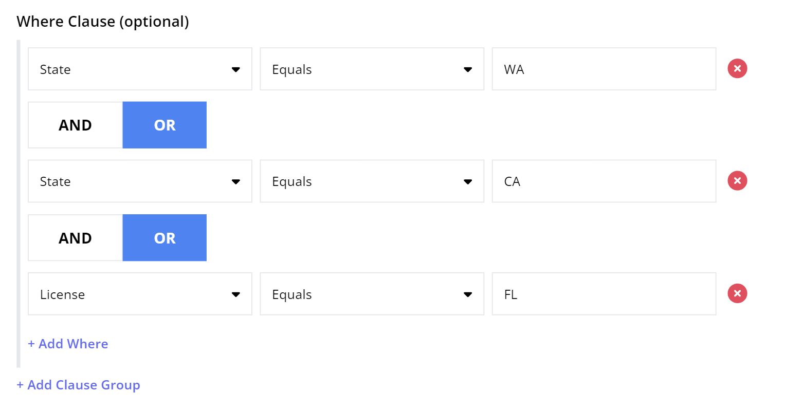
Example 3: Select all cell towers in Washington, California, or Florida:
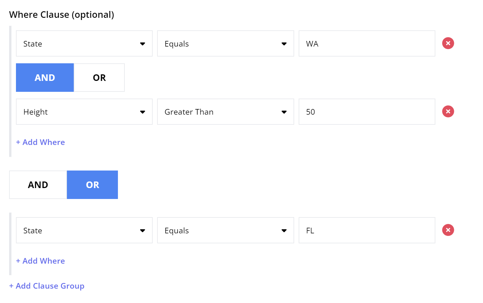
Example 4: Select all cell towers in Washington that are greater than 50 feet high, OR that are in Florida (regardless of height):
Managing Charts
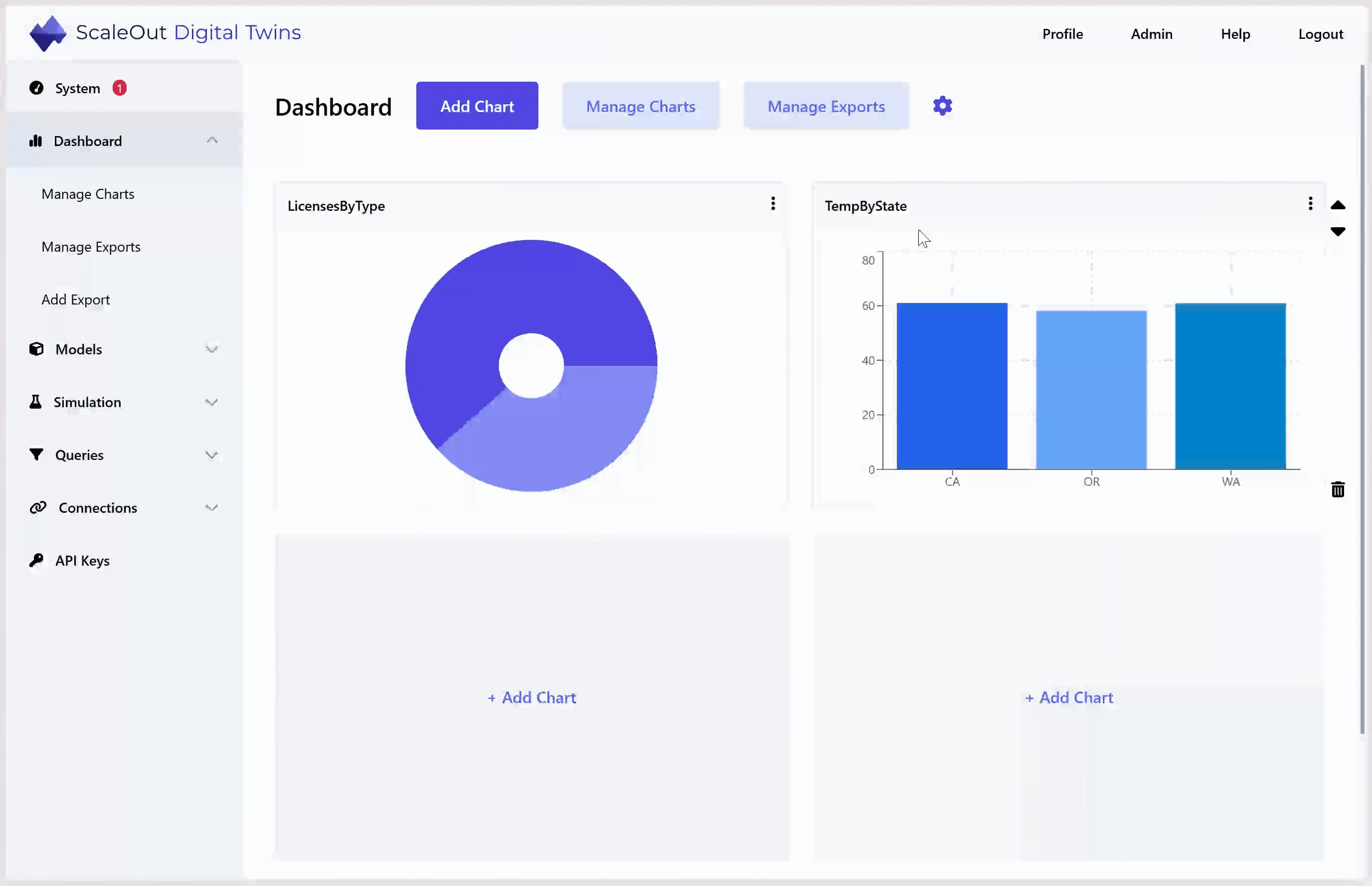
Chart Dashboard
On the Dashboard page, you can manage individual charts and rearrange the page layout to customize the appearance of the dashboard.
Managing a Single Chart
Click on the three dots icon in the upper-right corner of the chart to access options for that chart:
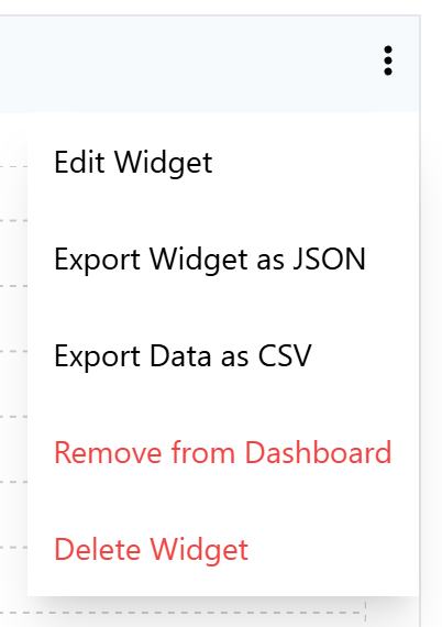
Edit Chart: Redirects to the Edit Chart page, where you can make changes to most properties of the chart. Note that the chart name and the associated model cannot be edited.
Export Chart as JSON: Download a file with a definition of the chart in JSON format.
Export Data as CSV: Download the chart’s current data as a CSV file.
Remove from Dashboard: Remove the chart from the dashboard without deleting it from the system. The chart will be available on the Manage Charts page and you can add it back to the dashboard at any time.
Delete Chart: Removes the chart from the system. This will remove the chart from the dashboard, stop further calculation of the chart data, and remove all existing chart data.
Rearranging Charts
There are several options for editing the layout of the chart dashboard. You can rearrange rows of charts, or drag and drop an individual chart to an empty slot.
To move a row up or down, hover over the row and up/down arrow icons will appear on the right. Click the arrows to move the row.
To delete an entire row, hover over the row and click the trash icon that appears to the lower right. You can also optionally delete any charts in the row.
To drag and drop a chart to an empty slot, first click and hold the chart anywhere in the title area. Drag it to the empty slot, and release the mouse to place the chart.
Note
Rows that are completely empty will be automatically removed when you refresh the page.
Manage Charts Page
The Manage Charts page shows a list of all charts in the system, whether or not they are shown on the dashboard.
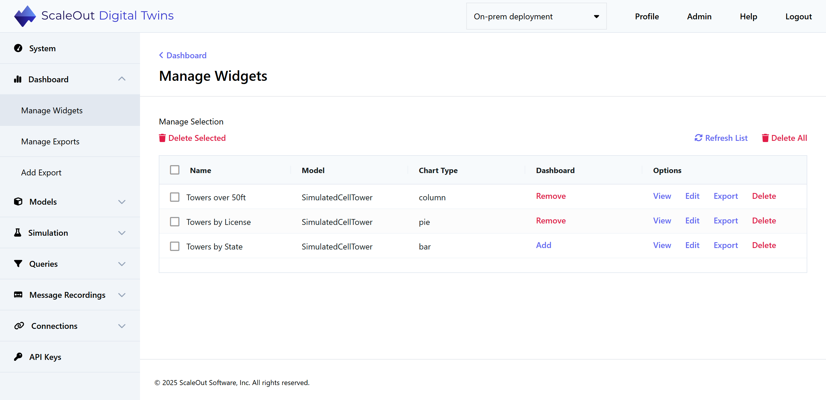
In the Dashboard column, you can see whether the chart is currently on the dashboard. If it is not on the dashboard, you can click Add to add it. You will then be redirected to the dashboard, where you can choose an empty slot to place the chart. If it is currently on the dashboard, you can click Remove to remove it.
In the Options column, you have several options for managing charts:
View: View the chart on a page by itself.
Edit: Open the editor where you can make changes to the chart.
Export: Export the chart specification as JSON.
Delete: Delete the chart from the system.
To delete multiple charts at once, check the boxes next to their names and click Delete Selected. To delete all charts, click Delete All in the upper right.